Showing posts with label CEED design help. Show all posts

7 May 2016

Picture composition - narrating a story based on an incident in an image


Usually in CEED or any other design exam for that matter, has the following type of question : Given an illustration of a incident/situation, narrate a story based on your creative imagination in not more than 200/300 words. 

Well, although this is purely based on your observation of the given scenario and derivation of useful links for the story, we can follow some rules/principles that might help us find way to you a creative and meaningful story. These points are already discussed by me in my earlier post - Frame a story by seeing an image - composed by our friend Aditi, I'm listing them again here for your reference. 

  1. Understand the question and know about the situation, ex. for the below picture, (story of which i'm writing down at the end), it was stated that "The illustration is an artistic impression of an incident in a club house". So, we NEED to flag these keywords - 'club house' and 'incident' inorder to start the story. The whole story should (most of the times) roam around the incident i.e. activity in the club house. This is very important! Spend time observing the given situation/sketch without jumping straight to write the story - Have a clear vision of what has to be written by framing the story Take time !
  2. Observe most of the individuals/character of the situation 
  3. Observe their activities - what they are doing
  4. Most importantly note/mind the "mood" of the character (if it is clear in the image) - it's very important in story framing ! 
  5. Mind the age and gender of the characters !
  6. Look for surrounding things - like TV, books, background (if its sceneray) etc. Background might be a closed room, might be a beach (ex. image shown in above post by Aditi), a school, a farm land etc. what not ? anything!   
  7. Try to derive a meaningful relation among the individual characters, and try to speak about most of the characters/things etc in your story 


There are two methods (I guess - might be more) of narrating any incident

  • By assuming one of the characters in the incident as yourself, and narrating accordingly
  • By assuming that you are not involved and you are seeing the incident, just like watching a TV and telling what is happening there.


Most of the times, in CEED exams, second method is applicable, I mean we just need to narrate the incident wihtout being involved (unless specifically mentioned)

Below is an example story that I wrote for one of the previous paper question - CEED 2014, Part B, question 2


Question :

The illustration above is an artist’s impression of an incident in a club house. 

Narrate the incident in your own words, based on your creative imagination. 

Limit your description to less than 250 words. 

Evaluation Criteria: 
Originality of the narrative 
Imagination and Ideation 
Story telling ability

Note: I remember, when I gave exam in 2013, they gave space (with ruled lines) for writing the story, which in actual is less for 250 words. I mean space is very less to elaborate the story. Keeping this in mind, I try to write a short story. Hope, that's ok for you.

My Story for the above situation

It's already 4.40pm in the evening and the so called meeting-head, who has to be there for the club meeting 'xyz colony welfare' is yet to arrive. Scheduled time was 4.00pm and so most of them, who arraived in time, are almost loosing their patience. Children started their naughty activites as usual. One of the colony resident 'Ramu' got totally impatient and inspite of his mothers attempts of pacifying him, he walked away form the club in order to go out and do some other activity, thinking that the meeting is not going to happen that day. 

His mother was trying to stop him with her level best, since the meeting is basically about conducting a counselling sessions for the teens in the colony and so she was interested in having his son present during the meeting. Mr. and Mrs. Shah, whom just came inside the club was wondering about the mess in the room. They stood watching Ramu and his Mom, whispering between them that they did right thing of being late. 

Soumya and her neighbour were trying to get hold of their kids and make them sit in the common waiting hall, children of whom were running here and their; playing with one another. Shyam Lal, who opened a temporary setup for selling eatables and drinks was having good time selling things for the desperately waiting club members because of being late. Meanwhile, Ajit and his wife were busy watching live cricket in television, and Meera aunt although not interested in watching, but in order to avoid getting into boredom state, also started watching TV. Assitant of the meeting head, Premji uncle is still confused on what topics to discuss during the meeting and so was putting all his intelligence to make the proceedings in order.

---------------------------------------------------------------------------------------

This is of course a simple story that I made quickly since it's already 2am ;) But, I guess you must have got some idea on how to deal with story writing questions. You can also refer to Aditi post - Frame a story by seeing an image for another example or you can share your own attempt of story composition writing in the blog specifically meant for design questions sharing for everyone's benefit.

Have a nice week with your story writings :)


20 November 2014

'Frame a story by seeing a picture' example

You are here Resources >> Picture and Image composition


Fortunately, one of our friend Aditi Chansoria, read through all the comments in our Everyday design practice post - regarding the need and help required with story framing from image kind of questions (also called picture/image composition). She took the below practice question as an example, did the writing and shared with me. Thank you Aditi for caring about others.

Question :


Check the below messy picture and write a story related to the situation depicted in not less than 200 words.


Image courtesy - kidacne.com

The composition as shared by Aditi 


It was a beautiful day. The sun seemed a little brighter, as the tourists were excited about the big ‘sunburn’ concert that was to be held on the beach later that night. The waves were high and so were the spirits.

The DJ console was set up at the centre of the shopping arena. As usual, Raj was supposed to be the jokey. ’Tonight’s gonna be a good night’, yes, everybody agreed. Few enjoyed the song while taking a sun bath, few stood up to dance, few were still busy with their shopping while some were interested para-sailing. Others who weren't doing any of the above, the waves invited them with open hands.It was obvious that everybody enjoyed in a way that pleased them, until a volleyball came and hit Raj on the head.

”Where did that come from?”

The DJ pointed to the direction.
Raj saw that a few people who initially belonged to the beach, had submitted themselves to the game. They made two teams and arranged for a ball. It was just a practice shot that went too far.

“Hey, there is a match going on”

For a second, everyone turned their heads and looked at the direction the DJ had pointed.
Suddenly, a few amongst  them had become the audience. Few supported the team with red bands while the others cheered for the other team. Everyone, the  man with the tube on him, the para-saile, the girls who were at ‘The grills’, even the children with  balloons started enjoying the match. It seemed like everyone was united now.

The match ended after three hours. The red-banded team had won. Everyone cheered for both the teams and now the players, no matter what their names were, were given a different name that the audience gave them-‘chottay,motu,tiger-and now they will be remembered by these names by a lot of people for a lot of time.

Its sometimes interesting to realize how simple things like a volleyball game unites people, and how these people, without knowing anything about the other, become one when they see a mutual cause. Everyone thought the players were the stars, while from where I see, The Beach was the star.

Hope you now got some idea on how to compose a story from the given picture with the above example shared by Aditi.

Bhanu's hints and tips for attempting similar questions :

  • Spend time observing the given situation/sketch without jumping straight to write the story - Have a clear vision of what has to be written by framing the story
  • Take time !
  • Observe most of the individuals/character of the situation 
  • Observe their activities - what they are doing
  • Most importantly note/mind the "mood" of the character - it's very important in story framing ! 
  • Mind the age and gender of the characters !
  • Look for surrounding things - like TV, books etc

Do a return favor of thanking Aditi below (by way of a comment) to appreciate her for sharing the story with us.

Like stuffyoulook Facebook page and stay updated with latest posts and updates !


2 November 2014

Everyday Design ideas for CEED practice

you are here ........ Practice >> Design exercises


Welcome back friends, like I mentioned (numerous times) in my earlier blog posts, much of the concern has to be given to design ideas as they are more important and are prioritized even than sketching part of CEED exam. It calls your creativity/capability to solve such questions. I feel honoured; for one of my last year's design practice question (design of public dust bins) that I dealt in this blog appeared in CEED 2014 for 50 marks ! That's why just like I did last year, I will be updating some design challenges ever-day to let you practice at your own pace.

This year, I will focus on posting questions that might probably relate to self/community development, in other words it awakens your social responsibility as a citizen; and simultaneously let you prepare for CEED. I would be introducing you to some new trends and dimensions in design, in other words practical design approaches. Please understand the essence of the question before attempting. I hope you enjoy practising these questions.

Some quick note on good practices :

  1. Read the question twice or more times until you understand it completely
  2. Don't attempt before it's understood, at times you will find wasting time doing questions in WRONG manner 
  3. Focus on meeting the requirements of the design/question and then do attempt accordingly
  4. Set a time limit to your attempts, just to make it a habit. But you may take more time as this is just practice section. Remember framing ideas and delivering that roughly/simply within the time are most important
  5. Don't include unnecessary additional's to your design except what required, if you are running out of time in attempting the question 
You may get more useful design related tips in this design example - Walking stick design analysis with some RULES 


Warm-up exercise 

The Indian Government, under the administrative rule of our present PM Narendra Modi, took initiative and developed an online portal for the common people (citizens) to raise their voice as well as suggest ideas to the different sectors of India - all related to policy making, public developments, innovations through effective participation of citizens and through other awareness programs. In this context, they started implementing some online contests for participants to design logo's, themes and many other things. 

As a warm up exercise and to let you participate in the ongoing contest, I would like you to complete the design and submit to the portal (as per your wish). You task is to 

"Suggest theme elements, tagline and logo for India's participation at hannover Messe 2015" 

Here is the Indian Government portal  where you would find the contest - Gov India online portal
For you reference, here is - Details and website of hannover Messe 2015

I also recommend you to go through the Gov. website for more similar contest for your leisure practice
  1. Swachh bharat abhiyan logo design
  2. Digital India mission
  3. Financial Inclusion Logog contest
Hope, the above warm up exercise would introduce you to some new platforms as well as inspires you to participate for public welfare !


03.11.2014


Hope you enjoyed doing yesterday's warm up exercise. I would like to see your logo being selected for that contest by Indian Government ! Well, let me start the first exercise as part of your design practice.

Imagine you are a super hero with gifted supernatural powers, and you are just like other marvel comic hero's - helping people around whenever some incident happens. Once you are just passing by, but suddenly you found a boy in danger (any kind of danger). Immediately you jump in to the situation (as a super hero) to save the boy out of the danger. Fortunately you saved the child just in time and received appreciation from the surrounding public.

Now your task is to make set of comic strips (not less than 3 frames) illustrating the above story/situation. I recommend you to frame the characters in an interesting way,  You may select any of the following tips for situation or character selection. Else frame your own situation.

Tips for situation selection
  • Boy being robed
  • Boy was about to get hit by a vehicle (truck or bus)
  • Boy was about to fall from a building accidentally 
  • Boy was caught in a home that was in fire
  • Or any of your own

Tips for hero selection
  • Your hero might be either men/women
  • Your hero can either fly, have tremendous strength or even can do other wonders
Enjoy doing this fun exercise by learning how to do comic strips. For getting deeper insight on  story board framing, you may refer to this - Story board and poster making guiding website links


04.11.2014


Exercise -1

Today's exercise would help you with 'Writing skills'. Last year CEED exam included this kind of question; probably to test candidates story framing and writing ability. This exercise has been designed so that would cultivate the habit of creative thinking and creative writing.

Carefully observe the below scenario (picture) and frame a story that would fit to the given situation. Write your story in not less than 250 words.


Image attributes : dennyhellman blog


Hints and tips for attempting similar questions :

  • Spend time observing the given situation/sketch without jumping straight to write the story - Have a clear vision of what has to be written by framing the story
  • Take time !
  • Observe every individual/character of the situation 
  • Observe their activities - what they are doing
  • Most importantly note/mind the "mood" of the character - it's very important in story framing ! 
  • Mind the age and gender of the characters !
  • Look for surrounding things - like TV, books etc

The above tips would give you some clues on how to frame a story from a given situation with much ease.

Exercise - 2

I would recommend you to practice one more writing exercise - although this type of question may not appear in CEED exam, but this would help you with writing comprehension or essay's.

Being a citizen of the nation, you got motivated with other's social activities by going through this motivational website - The Better India and so decided to write an letter/essay about your views/suggestions  on any one or all of the following issues
How to change Indian Economy ?
What ways to reduce poverty in India ?
What are some suggested steps to reduce cost of commodities ?
Or any of your own social concern

You are required to write the letter/essay in not less than 250 words. Hope you will enjoy "the power of writing !"


05.11.2014

All right, hope you enjoyed doing yesterdays writing exercises. Well, last year CEED paper surprised me by introducing new type of design question - GUI - Graphical User Interface. UI/UX designs are emerging as an fastest growing design field in the current digital/mobile world. So, today let's practice a UI question. You may get a complete information on GUI along with some good tips to attempt GUI questions here - User Interface Design principles and rules

Design a Graphical User Interface for a a smartphone (mobile phone) of a online shopping company for selecting a mobile device as well as allow for purchasing the same with all the payment process included.

Present your UI designs in the form of screen shots. Draw minimum of ten screen shots that depicts all the process - from home page, phone selection to final purchase confirmation.

As said above, you may check the above link for tips and tricks to handle such design problems.


06.11.2014


Today, we will do some exercise on sketching. Although, having design ideas is the first most concern for any designer, sketching stands second and hence play a crucial role in any design process. Sketching is the mode of conveying your ideas. So, you are expected to have at least 'Average sketching' skill as a beginner. Here is a jackpot to you !

I have also included some online ongoing design-contest today for your benefit.

Sketching exercise

You've given freedom at your school (or office) to enjoy comfort conditions/environment by taking your own requirements and fulfilling that. In this regard, the administration has asked you to give your necessities (with design demonstration) especially in regard to your work/study place.  Design your own class-room/office desk (sitting and working table) that meets your own necessities and requirements as per your convenience, showing all the accessories and inclusions that you wish wish would help you, compared to the present table design.You may choose any shape, include any attachment and so on.

Hints -
  • How about a semi-circular shaped desk for easy access ?
  • You may show charging facilities for your laptops/tablets as well as other power devices
  • Place for water and other food related things
  • Place/sections for files/papers/bags with suitable compartments
  • Fanning arrangements etc

External contest !

Hope you have participated actively in the first day contest, now here goes some additional contests :

Typography design contest on hiiiband blog -

Photography design contest on hipa blog -

Poster design contest on 'home-design' website - (Just for practice purpose, be cartful it's paid in $50 !)

Okay, finally; since you are practising sketching work, let me include the below video as a reference for making you aware of some of the common mistakes that last year students did while they practised - Please understand the common mistakes to avoid, and also learn how to be productive while sketching by going through this video.


07.11.2014


Well, today we shall practice making of posters.

India is one of the fastest developing country, next only to China (in economy). There's tremendous improvement in almost all sectors of operations, but still poverty prevails ! reason why ?

Like the country is growing fastly, it's population is also increasing massively, I can say double than that of the other growths ! currently it's near 1.2 billions out of 7.2 billions of the world ! (nearly 17% in a single country ?)

 The big difference between China and India is, Chinese citizens took great steps in reducing their population growth, may be people realized or may be their government took measures with awareness campaigns or so. That didn't happened earlier in India. Citizens are yet to get aware of the outcomes of the  rapid population growth. Say when a family has 3 to 4 children without having a family plan of 1-2 children, then that family suffers in all ways. The family leader feels difficulty in feeding all those children, can't provide education to many, can't look for their nutrition provision and so on. The final result - that family ends in poverty !


source : aljazeera blog

If the same family took steps and ended up with 1-2 children, then all the expenses are reduced - costs, educations, food, etc, So ultimately that deters their poverty level. If the same thing happens in every family, then .......... holla............ poverty gone in India with better economy and prosperity.

Okay, here is the deal, you are an official government representative and was asked to make an eye catching poster that would bring an awareness of population growth to citizens (especially for rural and urban slum residents); you may cover opt to cover any or all of the above ideas. Hope this interest you !

08.11.2014


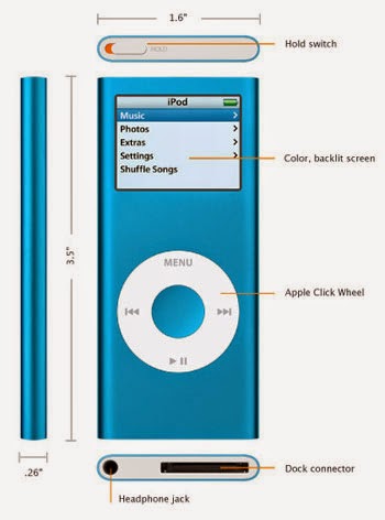
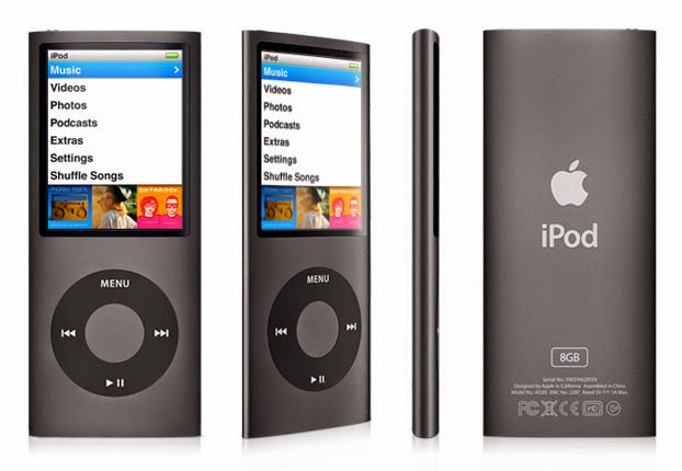
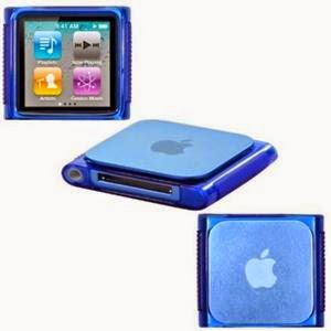
Today, we will practice on Product Design question.

You are working in a company delivery products specifically related to electronics or gadgets. Your company wants to design and release a mp3 music player with display included for volume controls, track/genre selections and other operation as a competition for the Apple's famous iPod Nano. You are a part of the design team and your team leader asked each one of you to come up with separate designs to select the best out of many or to mix different ideas in a single product.

Now, design your own mp3 model that is
  • Slim
  • Unique in terms of design looks, feel, operation - menu's, buttons etc
  • Select proper material that is - light weight, durable, aesthetic feeling and low cost (plastic is banned in your company)
  • Comfort and simple for carrying

The below pictures are included for your reference or idea, covering all the generations of iPod.


09.11.2014

Today, instead of dealing with design practice exercise, I have covered this weeks Part-A practice questions set for your benefit here -

CEED 2014 Part-A Practice exercise, week - 1

10.11.2014

Today, I have reviewed yesterday's Part - A mock test questions has. I updated all the answers with explanations (wherever required). Find the answers here

Answer key for CEED 2014 Part-A mock test - 1

11.11.2014

Okay, we will start again our daily design exercises as usual ! Here's two exercise's for today

Design Exercise 

You probably might have come across 'Electric bicycles' that is famous in developing countries like China. Indian Government decided to launch public owned bicycles that would run manually as well as on electricity (whenever required - but not always !). You are assigned the job of designing the bike, such that the bike is

  • User friendly
  • easy to handle with less arrangements
  • Less energy usage (renewable type)
  • Cost effective etc
You are required to identify 6 (six) distinct factors in designing the bicycle, identify the need for such bicycles in cities (explain that in written) and also come up with not less than three distinct design ideas. You should present your final design with necessary rough sketches.

Evaluation criteria
  • Practicalness - reality in design
  • Application oriented design
  • Rough sketches and construction
  • Identifying the factors and need

Exercise - 2

Check the below messy picture and write a story related to the situation depicted in not less than 200 words.


Image courtesy - kidacne.com

12.11.2014

Once a wild dog happened to meet a pet dog. Both were having conversation about their life. The wild dog wept out and told the pet dog - how forests are being encroached because of human interventions, and what lead the forest wild animals to migrate to cities and near by villages, ultimately making them fell into human traps. It told the pet dog, that pet dog's life is appreciable as they don't have any issues with humans. Now, hearing this, the pet dog started laughing at her and told how even the pet dogs are getting troubles from humans. It said that life in cities (and especially in connection with human) is miserable and it's turning out worse day by day.

Now, your task is to frame the above story and depict the same in the form of comic strip, in not less than three frames.

13.11.2014

We have covered almost all parts of CEED design questions, but just remember guys, sketching has to be practised simultaneously. It's equally important in exams. So, today I will include an exercise on sketching through imagination. I'm also including links for some of the sketch practice sections that I hid from this blog long back. If you are interested in practising by copying those questions, I recommend you to save those pictures to your system, because I will hide these links again by this weekend.

Sketch the view of a person sitting in a sofa in a room (home) and watching a TV.

Sketch examples


Those who want to practice sketching are advised to save these pictures, because I will hide these links again by this week end.

Hope that helps.

14.11.2014


Creativity Exercise

Ice Cream packages comes in different sizes - ranging from candy to family packs. Family pack ice creams are usually packed in a large bowl like boxes as shown below.


Source prepac

Materials used for packaging range from paper or disposable card rolls to plastic. Now your job is make creative uses of these boxes - to identify alternative uses of used ice cream boxes (of any shape or size) for day to day or regular use.

UI Design Exercise - 1

Current mobile devices runs mostly on any one of the platforms : iOS, Android, Windows, Firefox and some other minor operating systems (OS). You are working in a company developing a new mobile OS software.

Design a User Interface system, that is different from the current top OS. Show the screen shots of top 10 functionalities like start screen, menu, notification bar, widgets design and placing, settings, picture gallery or any other function. Also choose an app to display in your UI system.

15.11.2014


Modern Indian toilets trend has been shifting from traditional pour flush type to cistern flush type (western toilets) as shown in the below picture; owing to rapid urbanization. In all those types of western toilets, flush buttons were attached to the water holder (as shown in the picture) behind the sitting posture. So whenever the user thinks of flushing while at use, he need to turn back and press the button (hands get twisted), and it's really painful with hands folded as if doing yoga. This might be not a problem for everyone, but for elder people, they feel bit inconvenient. Your job is to

  • State the problems with the current cistern flush design, 
  • State the necessity for new design
  • Identify a minimum of five factors to be considered while designing a new system
  • Make three distinct concepts and show them in rough sketches.
  • Show your final concept with all the details in proper views through clear sketches.


16.11.2014

Today, instead of dealing with design practice exercise, I have covered this weeks Part-A practice questions set for your benefit here -

Part-A mock test - 2 practice exercises


17.11.2014

Please take time to complete a 2 min survey by filling the below form to help me better understand your needs. This survey would definitely help you ! 

CEED and NID Survey form - 1

By the way, Today I have released answer key for yesterday's Part - A mock test. Do check the explanations and answers here

Answer key to Part - A mock test - 2


18.11.2014

Exercise - 1

Bulbs have usually less life and after they get exhausted, they are helplessly thrown. Now find five creative uses of bulb (as shown in the below picture) and show the ideas with appropriate sketches.


Exercise - 2

Design a multi purpose brief case that is probably meant to carry important documents and of course cash and cheques. The briefcase should be designed to let the owner use it with full security and with additional things. Something like theft and missing intimation through electronic way (may be by app inclusion in mobiles) and any other features. Show the rough sketches of different concepts and finally come up with a design with neat sketches.

19.11.2014

Exercise - 1

The below picture shows a typical Indian small-scale tea shop in rural villages. The owner of that shop decided to spend and re-construct his small tea shop to make it a hotel with all food provision. Now, that entrepreneur approached you to suggest him with the changes to be made, and what are the facilities to be added to make his customers loyal and regular.


Source - Kafila blog

Your job is to identify the customers (village residents) behaviour and design a new hotel for that location.

  1. Identify the problems with the present situation
  2. State the factors or inclusions that has to be made to change that situation
  3. State the facilities to be provided for the concerned population
  4. Show the owner your plans with sketches and explanations
Remember that the shop is to be opened in the same area (rural area) and so plan accordingly, although the owner is willing to expand his business, but he cannot afford for something like high-cost furnitures, aesthetically pleasing interiors and ore. That has nothing to do in such areas, right ? Remember both the user's preferences and location cum situation are very important while designing. So, do come up with this idea and make your sketches.


Exercise - 2

Now, consider the case where the above same village is now famous for international tourist and there's a huge population of travellers from around the world visiting that village. Now, imagine the same owner willing to develop a hotel, this time to the outers and he is ready to invest much greater than the earlier case. For this case, do the above all factors and analysis and come up with sketches for the proposed design.

20.11.2014

Design a poster for an awareness campaign to educate citizens of India, about the importance of saving electricity/power. The poster should also depict various methods or recommendations to reduce power wastage as well as effectively utilize them for sustainable future. If possible make separate posters for rural people, urban people and for school children's.

Picture Composition and design guide

Some of our friends came forward to help you with picture composition (framing story) and other design solutions I received their works and I'm now sharing with you. Please go through the below links and get some ideas.

Example of framing a story (Picture composition)

Solutions for Everyday Design works from Sameer Sapre


21.11.2014

Exercise 1 :

Make different designs of electric bulb (CFL, or any other bulbs). Designs that cover past, present and future. Go for different design shapes and creative your own design of a unique bulb design.

Exercise 2 :

Design a carrier/lunch box for kids that would also allow to carry liquid energy drinks like juice, milk etc. preferably in a glass or narrow jar type. There should be a minimum of two layers of boxes and the design should be unique and should also accommodate rest of the lunch box.

NOTE : I have included some more design exercises for the coming days in advance.


22.11.2014

This question is a bit time consuming but worth trying as this kind of design questions helps you with portfolio. Government of India decided to offer some battery-powered electric tricycles to the owners of the current human powered rickshaws, in order to support their economic growth with reduced prices and loan basis.

You are required to submit a design that seems efficient, easy-use, cost-effective, comfort-travel conditions and more. The rickshaws are meant to operate in different Indian terrains (road conditions). Below shows an example for your reference.


Image courtesy : modularmachines blog

23.11.2014

In the usual tricycle auto rickshaw design, designers considered placing of single wheel in the front, and two wheels in the back/rear.  Why not reverse ? I mean two wheels in the front and one wheel in the rear ?

State your design views, also compare both designs by bringing advantages and disadvantages with your final selection/choice.

Tips : Consider some vehicle stability design requirements like steering control, traction, front face area for wind, load and other stability factors.


Essence of Designing - 1


When you are designing any thing -

  1. What factors do you consider in  mind, state the factors ?
  2. What are the essential and optional factors in any design ?
  3. What is the requirement for any design in real life ?
  4. Why multiple choices/designs are required ? In other words, why designs usually gets upgraded ?
  5. What are the deciding factors to justify that your designed product/service is better than the previous similar design ? 
  6. What are some common tools for getting design ideas ? 
  7. What tools we usually use to communicate our designs ? 
  8. Are designs required in all fields/sectors ? When designs are required ?  


Essence of Designing - 2


Any new design should probably be for meeting any faults in the previous work. The new design should be simple and easy to use, understand, cost effective/economical, special future's, either multi purpose or single use. Also the current climatic situations demands the designs to be sustainable - environmental friendly materials, long life, efficient functionality and so on.

Design is not always required in every field. The reason or necessity or requirements are the main driving forces to look for new designs. Now a days customer complaints plays a crucial role in looking for better designs, so understand the needs and/or requirements in any design, be it is for CEED exam or for real life designs. How better your design performs depends on what advantages your design offers compared to others, or if starting from scratch, then whether that idea is feasible or practical. Designing without a reason is just considered as hobby or passion, and if that is practical and useful to at least one user, then it's useful, else it would just remain as a passionate idea !

Design ideas comes when you feel the need, when somebody suggests you, when you go through some other ideas.


--------------------------------------------------------------------------------------------------------

Thus ....... I end this years everyday design practice !

If you are further interested in practising exercises, then do check the previous years everyday design question and practice them. There's some good number of practical questions, check the below link

Everyday Design practice questions with some solutions


Hope you enjoyed practicing questions. 

All the best !

Important note :

You may avoid some common design mistakes by learning here - mistakes in design sketch works

--------------------------------------------------------------------------------------------------------


22 August 2014

User Interface Design fundamental principles & guidelines


User Interface Design (UID) is the design of any interface systems that focus on interaction between human and machine/system. This design can be related to 'Interaction design' IXD in one way. 

User Interface designs could be related to :
  • Websites, blogs
  • Computers
  • Mobile devices
  • Software's
  • Machines like ATM, Voice recognizer, scanners
  • Appliances and more

Anything that humans interact with the systems are more or less related to UI Designs. UID are gaining importance in the current generation. Man is always struggling to design systems that would demand less interface or involvement of human. The latest technologies and interface systems supports our discussion - technologies like motion control, gesture control devices (see example - Leap motion control)  are emerging; that would even eliminate 50% of the current human effort. So, they are one promising design field to concentrate. 

So, that's why I took time to write this article giving much details from my own point of view as well as by considering reviews from around the web. Those who design apps, blogs, websites etc are considered directly as UI designers ! 

"In the beginning of this section, I have given the basic fundamentals and general rules that are involved in any UID. Later I included User Interface Design principles for mobile platform - as it's the most emerging trend and of course much improvements are still expected/needed in the mobile platform. At the end, I've given some good number of thumb rules (UID principles) from exam point of view - that might work very well for your CEED exam."

The following are some of the fundamental principles or rules in designing UI systems


1. Know the user needs/goals


The important part of designing an interface system is to identify the goal of the system. Goal in the sense
  • what is required/needed
  • what is to be delivered
  • whom are the users, their demography
  • what is to included
  • Time bound or any limits/constraints within which the system is supposed to perform the task

The designer should be keen to the above factors and work on it to make it deliver - what it is meant to.

2. Keep everything simple and neat


Simplicity is the foremost thumb rule in any UI design. Optimize the usage and design such that 'It can do most with the least interference'. Users look for their expectation and the UID should help them get it done with minimal effort of user. Any UI designs that would end up making users rework or redo the same things/process; thus causing additional effort by the user - are the worst criteria. Categorize and group up things appropriately. Give adequate space between feature to feature, don't join all elements/features in a line or in a way not recognizable; something like that shown below.

(Inappropriate way)

3. Easy user navigation


Navigation within the same screen as well as between the screens to screens are the most bothering thing in UID. Designers are working their best; continuously to improvise the current navigation system such that it's even more easy to use, understandable and aesthetically pleasing. Optimize the sequence as well as steps. Try to reduce/optimize the number of steps involved in completing any task by the user.The navigation system should definitely be easy to identify, without the need for searching where to go to reach a particular step. Also the same kind of navigation system is appreciated throughout the unique design process. Else, it would create confusion and hence waste user time as well as interest !

Also single click navigation is more appropriate than double clicking feature. Right clicking feature in UI designs are not appreciable (in case of desktop UI mode referred to as stationary). 

All the navigation's should preferably be within the same screen (webpage tab - without the need of going to a new page tab) except for the external links (links not related to that webpage or app). The design should let the user easily understand where they are (which step) and how to navigate to any other step (at least to prev and next steps as well as to home or main page) at any point of time (any step or screen). 


Don't make the users jump here and there, navigation should be in an order, step by step or smoother way. Say for example, if you put an option to select in the top - whenever someone clicks it and when you put the next select option at the bottom or somewhere else, it would create confusion. Avoid such kind, make it easy to read, visualize and even understand.

4. Don't over stuff with details


Include only the information users needed and avoid flooding the screen with unnecessary additions. Say for example in login page interface, including some simple and basic steps/boxes like - login, password, forgot password, home and other related features seems more appropriate than including something like 

"we offer you with ......", 
"welcome to our page, xyz is good at ........". 

These information's have already been known to user and there's no need to include or repeat the same in this step. Also, the login page is supposed to function like 'login page' only and not do any other unnecessary functions or advice !

5. Make it familiar


Familiarity in the sense, the type of interface being known to the user, but put in some unique or interesting way. When the user knows about the procedure or when he is able to guess what comes next - after doing what, then he would be spending much less time searching for the functions or understanding each elements. So, design your interface very familiar; if possible universal - but represent them in some unique or eye catching way to give more appealing feeling to the user.

6. Screen layout and relationships 


The layout should be simple with good amount of categories, sub groups and with simple details because it contributes/influence the aesthetic appeal as well as have tremendous effect on the usability of the design. Group things on the screen effectively. Alignment and positioning of blocks, controls, text, typography, white space, consistency of elements and simplicity in design are all some important factors in contributing to simple interface layouts. 

The following picture shows the recommended alignment feature.


7. Readability 


Most importantly, the design need not include heavy changes in font size, font type and also in color. A simple and plain font format is the most recommended one. Such font types are appealing and in fact easy to identify. It's best to stick with simple sans serif or serif fonts where possible (for original UI designs). Script and other decorative fonts generally look better in print than on screen, and can be difficult to read at smaller point sizes.


8. Font sizes matters too


Bloggers as well as website designers choose large sized fonts (compared to the main content) to show article title's, headings, sub headings, menu's etc - just to make it eye catching. Because obviously, it's the larger font that drags the readers/users attention at first sight. So, be wise in choosing the correct font size (large, medium, small) to different functions of your UI design.

9. Symbols confuse


Other than using pre-defined symbols (symbols that are universal and are well known and recognizable), using some other symbols would confuse the user in knowing what it's up to - I mean; as to what action it actually does when we go through it. So, it's not recommended to use any newly designed favicons/symbols for any action or buttons (particularly in such cases where we expect new visitors instead of frequent or same users). 

Else you will have to educate them or make them learn  for proper navigation or communication. Visuals are great but not always. Everyone won't perceive a visual in the same manner ! It depends on the user and so be careful while choosing any visual or symbol ! The below picture shows a common icon that has been used in many websites or blogs. But just imaging what would the user think whenever he/she sees the icon. What action does it relate to ? difficult to find right ?


Use the same color to each set/group of functionality, for easy understanding. Say for example use grey color to all the buttons, light brown to all the menu tabs, white blank space on locations where the user were supposed to enter details and so on. Also use unique colors (not similar to other function colors) for text or typography links - that when clicked would take the user to the concerned page. Bold lines, bold borders, bold fonts are also some ways of giving special attraction to some important parts of the design. Don't include the same color for both interactive and non-interactive features. 

10. Visuals are powerful but to a limit !


If possible, you may use images. Pictures/images do a great job. But be careful - the use of pictures as well as icons may also add visual interest to your application, but again, careful design is essential. Images can convey information more effectively without the need for text, but images are often perceived differently by different people !

11. Transfer-ability 


Try to design your interface such that same kind of procedure or steps applies to to all components of the design. Say if you use check box type of functionality for selecting an option, then better to follow the same functionality for other options of your design too - instead of making something new like drop down menu etc.

Anyway; the most important principle of interface design is 'simplicity'. A little forethought could help you create an interface that looks simple to use. Also, from an aesthetic standpoint, a clean, simple design is always preferable.

12. Include status of user action and acknowledge 


For the action of the user, say for the case of online movie booking example, something like - 

"Thank you for booking your ticket, your ticket has been confirmed.  
Details of booking
Name :
Cost :
Class : balcony
show : xyz
date : 
time :

A mail has been sent to your mail ID and a sms will be sent to your number soon. Happy watching !"

Something like this (and a feedback form) will do a great job for users. This kind of warm interface applies only when working in stationary UID (desktop mode), and if it's mobile type, then reduce the details and keep all acknowledgments short and brief.

13. Sequencing - sliding visuals


Sequenced sliding visual pictures that would probably give a brief overview of all the categories of the website or any other UI for that matter; have been gaining popularity these days and of course they are much appealing to users.

14. Tolerable interface ?


Design an interface such that it can also cope the mistakes of the users without showing error. Most of the users does mistake while navigating or entering or doing something with the interface and your design should be in a position to tolerate them and guide them smoothly.

In case of UI designs where some purchasing or contributions or social works and something like these are expected, then don't forget to include some/all of these functionality in the design
  1. Signin, signout for registered accounts or 'use as guest' option
  2. For the case of purchase option include options like 'Email ID', 'Contact no./mobile', 'Address' (only for some cases) and Location etc. to make it more practical application.
  3. Always provide the 'change/edit' option in your interface designs - especially when the user is supposed to enter some details to get some information, get something done from it

Mobile UI Interface Principles


For designing mobile UI's, or an app for mobile devices and tabs, make it as simple as possible with very few details on every interface page. Remember, there's a lot of difference between a desktop interface (called stationary) and mobile interface. All the features of the desktop system couldn't be (and preferably shouldn't be) included in mobile app format. 

The following are some of the best principles that I noted in case of mobile interface designs

  1. Avoid inclusion of web page name or app name except in the main home page ! avoid including heavy logo's or heavy designs (see picture below) throughout the screen's
  2. Avoid writing lengthy explanations like "welcome to the app, this app will help you ........" or something like this; like we do in normal stationary (desktop) mode. Desktop designs are alpha-numeric while mobile UI designs should preferably have pictures or tag buttons. Screen size is the big factor and of course it is the big challenge in UI designs of mobile's. You are supposed to accommodate all the details of the desktop mode in that small screen, so be creative and think alternatively in reducing the unnecessary explanations or some kind of wordings like - welcome, thanks givings etc.
  3. A mobile UI or any app for that matter should be sharp, brief with very very less details but should cater the same functionality as that done by a regular website mode.
  4. Optimize the number of steps or sequence
  5. If working on mobile UI, then preferably make some predefined interface system such that the user need not want to type or enter much details. Mobile users really feel inconvenient in typing lengthy details in their phones. So, design a system such that some predefined or select-able option types are included - like say check boxes, buttons, tabs etc. If say you were to transfer money from any mobile app, then how about having a drop-down menu that enables selection of different denominations ranging from thousands to hundreds (already predefined) along with alternative choice of entering manually too ?. Some ideas like this (where there is little user requirement of hand-typing) are mostly recommended. 
  6. As far as possible avoid scrolling feature in mobile mode. Keep everything and every detail - in the same screen without the need to scroll to see.


[The following pictures are examples of a mobile app compared to website app with screen shots]

Desktop interface of Axis bank 


Mobile interface of Axis bank 


What to include in UI Designs ?


The following list would give you an idea on what can be included in your actual UI designs

  • Categories, sub headings and menu bars 
  • Tab bars, buttons, dropdown menu
  • List boxes, text boxes and checkboxes
  • List view and tree view, 
  • Tags, search bar, scroll down bar, 
  • Contact page and help page
  • Icons, notifications, messages etc.
  • Also for selection type of UI's, include options like 'cancel', 'next', 'back', 'home', 'change selection' and other multiple selection features.
  • For account type UI's, include options like 'change pass', 'forget pass', 'login', 'logout', 'profile edit' etc.


Now, we have seen the comprehensive principles of User Interface design or so called Interaction design. We will now conclude this section with design thumb rules from CEED exam point of view

Some of my own UI Design rules - for exam point pf view


  1. Simple-simple-simple : keep the design as simple (yet powerful) as possible
  2. The first step/screen to be shown in your design is your Home page or main page. Don't jump - showing the direct step where the function is to be started. All UI design should preferably start on a page (main page) where the user lands when he types or clicks the website or any other UI for that matter. Your navigation process should tell on how one can reach the targeted function starting from the first step itself and it should preferably the main landing page.
  3. As far as possible, avoid separate sections for user registration or even sign-in's. You would be getting less time and you may be required to complete the UI design in very less screen shots. So, unless they require more than 10 slides, avoid this feature. If they demand something like say 20 slides, then in that situations, this kind of process/feature helps you utilize all 20 screens ! 
  4. I never recommended coloring for any of the design sketches in my earlier posts or videos. But honestly speaking; for attempting UID kind of questions, coloring is one important phenomena that you may consider. Take it for granted; visuals (esp. unique colored boxes, details, pictures, links and so on) are more appealing & eye catching; and obviously they are easy way of making user-friendly interface. So, go for it and do include your design's with colored details. I guess, they work remarkably fine !
  5. Avoid including 'scrolling feature' both horizontal and vertical scrolling (i.e user scroll down to watch the next detail in the same page) in your paper-made UI designs; both for stationary and mobile mode. It's not recommended from my side, since it doesn't give the complete details in the same page as well as it forces you to use two screens to deliver the total content of that particular page !
  6. Voice control features (another mode of interface) are very good in real life UI designs, but for the exams - it's never recommended. What they expect is visual mode of interface and not other modes. So, just avoid this feature if ever some similar kind of ideas strike your mind. 
  7. Avoid three dimension (3D) kind of features, make it 2D and keep it as simple as possible
  8. As far as possible avoid pop-up menus
  9. Concern for the alignment of the features as mentioned above with the picture
  10. Avoid investing much time on website logo designs and shadings. Do these; only after you complete sketching all the screens and that too, only if time permits ! Remember - representing all your screens are more important than showing less screens (with good details) but being incomplete in design process ! 
  11. Design interfaces - such that even a lay man can easily navigate through the interface system
  12. Don't messup UI screens with loads of data, text, pictures and any other thing. 
  13. Leave some negative space. Negative space makes important content and functionality more noticeable as well as helps in easy understanding. Include only the information users needed and avoiding stuffing unnecessary additions. 
  14. Don't forget to give outline (box type) to most of the functions or select options. Else the user might not know where to enter and what to select.
  15. Avoid including advertisements while concentrating on UI designs for exam.


If you are much interested regarding this subject (UI design) and wants to learn about UI designs beyond what I have explained above, then you may refer to the following referral links (some of them are downloadable) catering both stationary as well as mobile UID with relevant guides.

Like Stuff You Look blog on Facebook page to get connected with latest posts.